 The Aesthetic Academy name and logo lacked any personality so a new name was needed
Over the years we have gained a reputation for producing work with bags of personality. We call it the Toward way. It's pretty rare that we get asked to do something so off the wall that it stumps us, but we recently worked with a company that thought we'd be up for a challenge. That company was Aesthetics Academy, a non-surgical cosmetic training organisation. They are now called Honey Fizz. Here's the story how.
The Aesthetic Academy name and logo lacked any imagination or personality and was being used by a number of competitors. The logo of two needles making an 'a' was both appropriate and a bit scary at the same time. It got across the idea of administering fillers and Botox, but it was too obvious and too medical. The same would be said for the colour palette of light blue and grey. Director Chantalle wanted a name that would get people thinking and was unrelated to the services, it had to be quirky and different. Honey Fizz is all of those things!

In order to name any company you need to understand the business, its customers and its values, as well as the wider industry. And in the case of Aesthetics Academy, we had to quickly learn to ignore much of that and look at the surreal. Having picked Chantalle's brains and embarked on a research phase, we gathered the team and started to come up with names. We decided early on that we wanted two unrelated words to combine to help create something unique. Our ideas session led us from snakes to colours and from fruits to sweets!
After a while, we settled on Mint Cherry, something fresh and unrelated, but even this was considered too serious. After more research, we started looking down many random avenues including different languages. One such 'language' ended up being cockney rhyming slang, which turns 'face' into 'boat race'. This got us thinking and after much searching we found a famous boat from the 19th Century called 'Honey Fizz'.
 The old website was too clinical and looked to much like a generic template which lacked personality
Once the name was agreed we set to work on the visual identity. We experimented with typography and ended up developing a logo which uses ITC Souvenir as a base font, which has been customised. Part of the customisation was a ligature joining the letters 'n, f and i'. This helped form a smooth shape that we used to create a subtile 'honey dribble'.
We opted for a strong yolk yellow and black colour palette, a nod to bees of course. We also introduced a secondary colour of blue to act as a way-finding tool by using it for links and clickable content on the website.
 The new Honey Fizz website introduces a consistent brand style, and a simple, bold colour palette
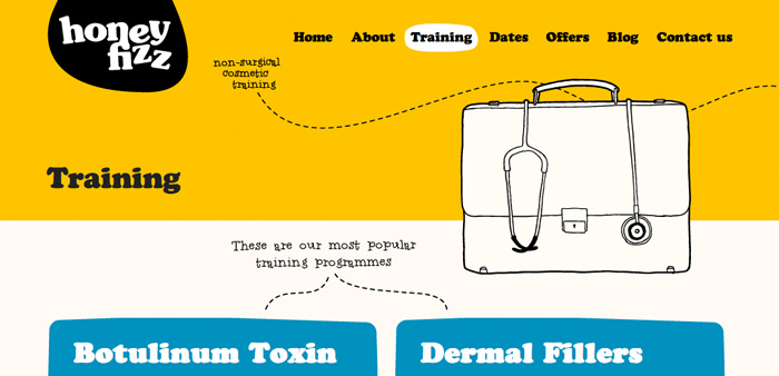
Once the identity was agreed and the stationery had been designed we moved onto a CMS website. Again it was key to inject as much personality as possible into the pages, without distracting from the content. To achieve this we created bespoke illustrations for each of the top level navigation pages, and small hand rendered touches around the site.
The whole site is managed by WordPress to allow the Honey Fizz team to add and edit content whenever they like. We also hooked the site up to a CRM they already had set up, so all enquires are stored and available for use later on.
 Quirky illustrations help add character and personality
Chantalle said "Toward have delivered a design exactly as I imagined, there were no templates and the visions of the brand we clearly discussed all the way through. Their clear organised manner really appealed to me, as we had meetings set out as the project progressed. I'd highly recommend Toward to anyone who wants to stand out from the crowd and get their business vision across to their customers. A great company to deal with, who are fun, contemporary, yet very focused on getting the job done properly!"

We're really excited about the future of Honey Fizz and proud to have been involved in such a radical brand overhaul. Take a look at the new site here and come back to let us know what you think in the comments.

