
Every few months the whole team sit down and take a good hard look at our own design work, including our website. It’s something we recommend all our clients do. The design industry (like many others) changes so quickly, it’s easy for content, design and technology to become out-dated or no longer relevant. Job roles change, new people join which can change the focus of services and developments in the business can have a knock on effect.
Why the update?
We try pretty hard to keep our website fresh with new blog content and updates to our work section, but we’re big believers in constant iteration — small changes that keep a website evolving. Sometimes larger changes are needed. When we sat to discuss the site, the number of small tweaks started to mount up. Slight changes to copy became rewrites, updates to icons became major overhauls and trying out different typography resulted in a whole new grid.

When Louise joined us a few months ago, she wanted to make sure all our communications from proposals and documents, to quotes and invoices were consistent. Rob and Louise worked together to rewrite and reposition our communications, and the design team created a refreshed design style that tied everything together. It was really important that this carried over into the website.
The content
Most of the early changes were focused on the copy. With Rob’s new focus on content we needed to make sure our Services and About us sections reflected our new offerings and told the full story. Writing for yourself is tricky and we fretted for hours over individual words and small sentences, but every word counts.
We reviewed all new content and asked questions such as "is the tone authentic" and "is the language appropriate"? We had to ensure the content reflected our personality and after some final edits and tweaks we had signed off content to work with.
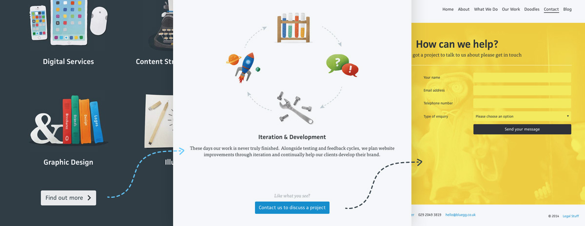
The design
Since our last major website launch in 2011 we’ve been happy with the overall look and feel. We’ve made lots of little changes and refreshes and we wanted this version to continue the evolution.
One of the first changes we made was to the typography, moving headings from a thin variant of Museo Sans to the stronger, chunkier JAF Facit. Chapperal Pro is a lovely typeface for body copy, but we felt that Tisa Pro was slightly more relaxed and worked better at the larger size we planned on using.
We decided to move away from the gallery style carousel on our homepage and put a single project front and centre of the new design. These case study images change when the page is refreshed to keep the whole look of the site fresh.

The content of our old 'Services' page (left) had become outdated, so we tasked Rob to write a new story. Gareth complimented the copy with a set of beautiful illustrations to complete the picture.
The biggest design change to the site is to the What we do section. This is mainly down to the changes to the way we work these days and our focus on content offering, alongside our design and digital services. We’ve used illustration to tell the story of what we do and how we do it, which makes the content much more engaging and enjoyable to read.
When reviewing the old site we realised we were missing opportunities to help visitors discover more content and help us convert them into enquiries. We’ve taken steps to fix this by linking our Work and Blog entries to other relevant pages and adding calls to action which lead visitors on a journey around the site.
The Shaky Faces
If you've already visited the site (other than this post!), you may have noticed our interactive 'shaky face' team pictures. These have been a big hit so far and we've had a fair few laughs playing with them ourselves. This started out as an idea we had after messing around with our iPhone's amazing 'slo mo' video feature. They were immediately hilarious so we thought we'd do it properly and enlisted the help our friends at the excellent Yoke Creative who are based in the same building as us.

Once we had the footage to work with, we set about figuring out how best to implement it. Initial experiments using HTML5 video were positive, but Safari chokes on playing video backwards for some reason. Plus, it wouldn't have worked at all on iOS devices as you can't play videos 'inline' let alone scrub them. Nevermind, we thought. "We'll do it old-skool using sprites!"
Sprites have been around since the early days of computer-animation (think old video games) and for good reason — they work brilliantly. What this describes is the technique of placing every 'frame' of an animation in a single 'sheet' viewed through a 'viewport' the size of a frame. When you move the image, you get an animation; just like the old 'zoetrope' devices from pre-cinema days.
Actually getting the frames required was a matter of exporting the videos using Photoshop and then combining them together using the excellent 'spritesmith' Grunt task. This wasn't without it's problems though as the resulting sprite (here's one of Tom) are massive, even at a reasonably low framerate.
Some browsers don't like loading huge images either; Safari on iOS in particular has a fairly low limit on the maximum size of image it will allow you to load so we had to create a few different versions at various dimensions and frame-rates to cover all the bases we needed. If you're a developer, then it probably won't come as a surprise that Chrome was the easiest to please and Internet Explorer was the most problematic!
Adding the interactivity was simply a matter of calculating how many 'frames' there are (from the height of the image) and using that to figure out which point on the x-axis of the image corresponds to each frame. Therefore when the cursor (or finger on touch devices) is in that area, we just move the image to the corresponding frame. Easy!
The performance
The advent of responsive design has seen a resurgence in the importance of webpage performance. We simply cannot rely on lightening fast connections where mobile is concerned (although with 4G networks, your mobile internet can be faster than your home broadband!) so greater consideration has to be given to how much data we send to devices. Although the previous Toward website was by no means slow, we were keen to see how much extra we could squeeze out of it. So, we’ve employed a few techniques to make things even snappier.
The biggest benefit has come from lazy-loading images. This means that certain images aren't loaded until after the page has been displayed, making things seem much quicker. This also allows us to have a peek at the size of the browser beforehand and load a size that's appropriate so we aren't sending a 1600px wide image to a mobile phone.
Every time a web browser asks for a file (be it an image or some code) there’s a slight 'overhead' slowing things down. By combining images into 'sprites' wherever possible and merging CSS and Javascript into single files we’ve cut down on these http requests. The homepage alone has half the previous number making it feel much snappier. Cashback!
#Winning
So all this sounds fancy in a nerdy kinda way but what has this actually done? Using the Developer Tools in Chrome, we can see exactly what the browser is doing when it loads the page, including how long it takes to download the total “payload” of the page.

As you can see from the comparison of the old homepage (left) and the new one (right), we’ve decreased our total page load from 2.3mb to 772kb, that’s pretty much a two-thirds reduction in the ‘weight’ of the page. On a broadband connection, the difference is negligible but on a potentially slow mobile connection the difference can be significant. Using the Chrome Developer Tools to simulate an iPhone 5 on a 3G connection, we can see that the old site took roughly 25 seconds to load whereas the new site takes under 10 seconds.
This doesn’t give the whole picture, however. By lazy-loading images the page is visible to the user in only a couple of seconds, with the ‘hero’ image appearing only after it has loaded. This drastically improves the perceived quickness of the website on slower connections.
As we iterate on the current version, there’s more that can be done to make sure we get our website to users even quicker. Look out for future blog posts on this very subject. So, there we have it. What started off as some small iterations ended up as an accidental redesign. We hope you like the new version, drop us a Tweet to let us know what you think.

