We love films at Toward. Most Monday mornings consist of film chatter over coffee, discussing the latest cinema release (or the latest low budget B-movie my wife Kelly has bought – she's mad about them). We often chat, review and generally pick apart the bits of films we love, and the bits we don't. As a creative bunch, one part of a film that we love to discuss and analyse is the title sequence. Some title sequences are so beautifully produced they can actually outshine the film that follows them. It's great to look back at titles and find tiny details you missed the first time around, it's also great to read about the stories and methods behind them. That's why we love Art of the Title.

Art of the Title is a website that showcases title sequences with heavily researched posts and interviews, often going deep behind the scenes of their production. We've been big fans for a while, but recently they launched a brand new site which has put them on a whole new level on our 'like list'. The new design is beautiful. Simple, uncomplicated layout, great typography and an expertly crafted mobile experience all add up to a site that we keep going back to. But that's just part of it.

We're big believers that a piece of design, communication or reference is only as good as its content. And this site is ALL about its content. The depth of knowledge and research is pretty phenomenal. I've lost count of the number of times I've read, and re-read their entry for The Girl with the Dragon Tattoo sequence, which is outstanding in its own right.
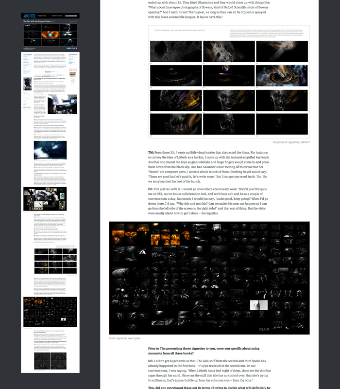
One part of the new site we especially love is the layout of the individual articles. Using a flexible grid, the designers have used images and video in a number of different layouts, placements and sizes to give a really interesting and absorbing reading experience.
 The grid allows some really interesting compositions and layout like this
If there was thing that we would change it would have been the logo. It's not our favourite part, but that's just a small quibble on an otherwise awesome site. We look forward to losing many more hours reading the articles and oohing and ahhing at the visuals.
Check out the site at www.artofthetitle.com and let us know what you think in the comments or on Twitter.

