A few months ago we were selected to help Skills for Health, a skills council for the health sector, build something pretty special. It started off as one of those "We want to build a LinkedIn for health..." projects. We’ve all had those right? We were intrigued to find out more.
Following a fact finding meeting, we discovered that Skills for Health required an online platform for health workers to find the latest news, discussions and information about industry training and skills. Focused around the creation of groups, covering specific topics, users would be able to create profiles, start new groups, create discussions and connect with people.
We thought it would be good to share some of the processes and work that's been going on behind the scenes. Here I'm going to talk about our approach to the project, the naming and branding, how we used user stories and designing in modules for the UI (user interface). In a future post, we'll look at the more technical side, covering frontend and backend development.
Approach
Since we kicked off the project in July we've been working in short sprints to achieve small, but achievable chunks of work. This has applied to the planning of features and functions, the user interface design and platform development – all of which we've done in-house.
Users first, scope second
This type of project typically starts with writing a huge and hefty scope document, outlining every feature and function that could possibly be added. The problem with this approach is that, most scopes are based on some research, but mostly assumptions. This can often lead to building large chunks of functionality that users may not need or want. Large, detailed scopes also take a lot of time to produce, a luxury we didn't have due to a 4 month turnaround for launch.
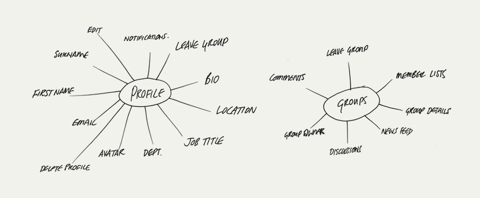 Example of the user maps we created to define the needs of each user type. This was a really quick and dirty way of visualising the needs we needed to consider.
Rather than using a scope we focused on user needs, breaking up users into groups depending on what they would use the system for. This approach ensured we didn't consider fancy features, instead carefully considering only what users would need to achieve to make the platform usable.
MVP – Minimum Viable Product
It became clear that the only suitable approach to this project was to build towards a minimum viable product for launch. This meant building only the absolute necessary features to ensure a user can perform the most basic, but vital functions – anything deemed not absolutely vital to the usability was removed from planning. Our motto has become "If it doesn't break it, remove it".
This approach has worked really well so far. Predominately it's meant that we can reduce development time substantially, by only focusing on core needs, but it also means that future iterations and improvement can be driven by user feedback, rather than assumptions and preconceptions.
Mobile Ready
One of the requirements of the brief was to have a mobile version of the platform – not a simple task. We analysed and assessed a number of different options for this, including a dedicated mobile version, a smartphone app and a flexible responsive site. We decided, starting from scratch with no legacy layout or code to consider, was the perfect opportunity to build a fully flexible grid and make it responsive. This gives us the added advantage of being more flexible going forward as we can accommodate multiple device sizes in the future.
All pages, including the management pages and admin sections are responsive so the whole system for all users is available on mobile devices.
Name & Branding
The original name of the platform was 'Health Skills Network'. Whilst this was descriptive, it lacked a personal touch needed to reflect how users would be able to share information, have discussions and form social relationships. We developed the new name – 'My Health Skills', which creates a better balance of description and emotion.

To help reinforce the personal nature of the platform we used hand written typography for the word 'My', complimented by the simple, open and rounded letterforms of FS Albert for the other text.
User Stories
Using the insight and structure we gained from the user maps, we started to look at individual user stories – focusing on the journey a user would take to complete a particular task. Examples of the processes we covered in user stories were Account Registration, Sign In, Group Creation, Content Editing, Member Management and Global Administration.

These stories started off life as notes and scribbles, then rough sketches, then low fidelity wireframes. The aim was not to focus on visual design, but rather structure of content, hierarchy and above all, helping users through their journey as easily as possible.
We found this approach really helped the client understand how things would work as they had a visual reference. The stories were also very quick to produce as they were so low-fi, and have now helped influence the development of the front-end and backend work by breaking it up into small chunks rather than a huge scope.
Designing In Modules
It's become quite clear over the last few years, since we've been working on responsive websites that the days of creating finished visuals for web pages are going away. Designing flat visuals for clients to sign off, whilst considering the endless array of device sizes is no longer a sustainable approach to most web design projects.

Again, the user stories we created helped out here. By giving us a structure and visual hierarchy we were able to create design modules, that can be reused around the site. These modules included, among others, navigation, side bar elements, calls to action and typography.
Creating a small number of reusable elements was key to reducing design and development time, whilst giving the client enough visual information to make decisions about look and feel.
Building My Health Skills — Part 2
In the next part of the series, Paul talks about the more technical part of the development process and the mystical world of the 'Backend'.
What's Next?
We're currently in the process of developing the whole custom backend system, and building the frontend modules. The launch is planned for the first half of November, and we'll be following this post up with details of that development. Eventually the platform will be live at www.myhealthskills.com
We'd like to thank Skills for Health for getting us involved, and letting us talk about the project. We hope you've found this post useful. If you'd like to ask questions, or let us know how you've tacked this type of work, drop us a tweet or an email.

