Plurimi came to us needing a website that represented their business values and conveyed their story, history and ethos through design and copy.
Workshop
We visited Plurimi HQ to run a workshop and gathered valuable information that allowed us to design and build a website completely tailored to their needs. The primary users of the website were defined as private clients, institutional investors and prospective hires. The most important element for these users was perceived to be reinforcement of the brand tone and values.

Content
The website was to predominantly be used as a due diligence tool, so it was important that the content was stripped back and concise. The tone of the content was also a key consideration—ensuring all copy was consistent in tone and accurately represented the business whilst remaining human.
Look & Feel
From a design point of view the website needed to build upon the the existing branding which is contemporary, clean and high-end. It was clear from the workshop that the website needed to showcase the Plurimi culture. The website needed to convey trust through effective use of white space, beautifully shot photographs and subtle animations to add depth and movement.
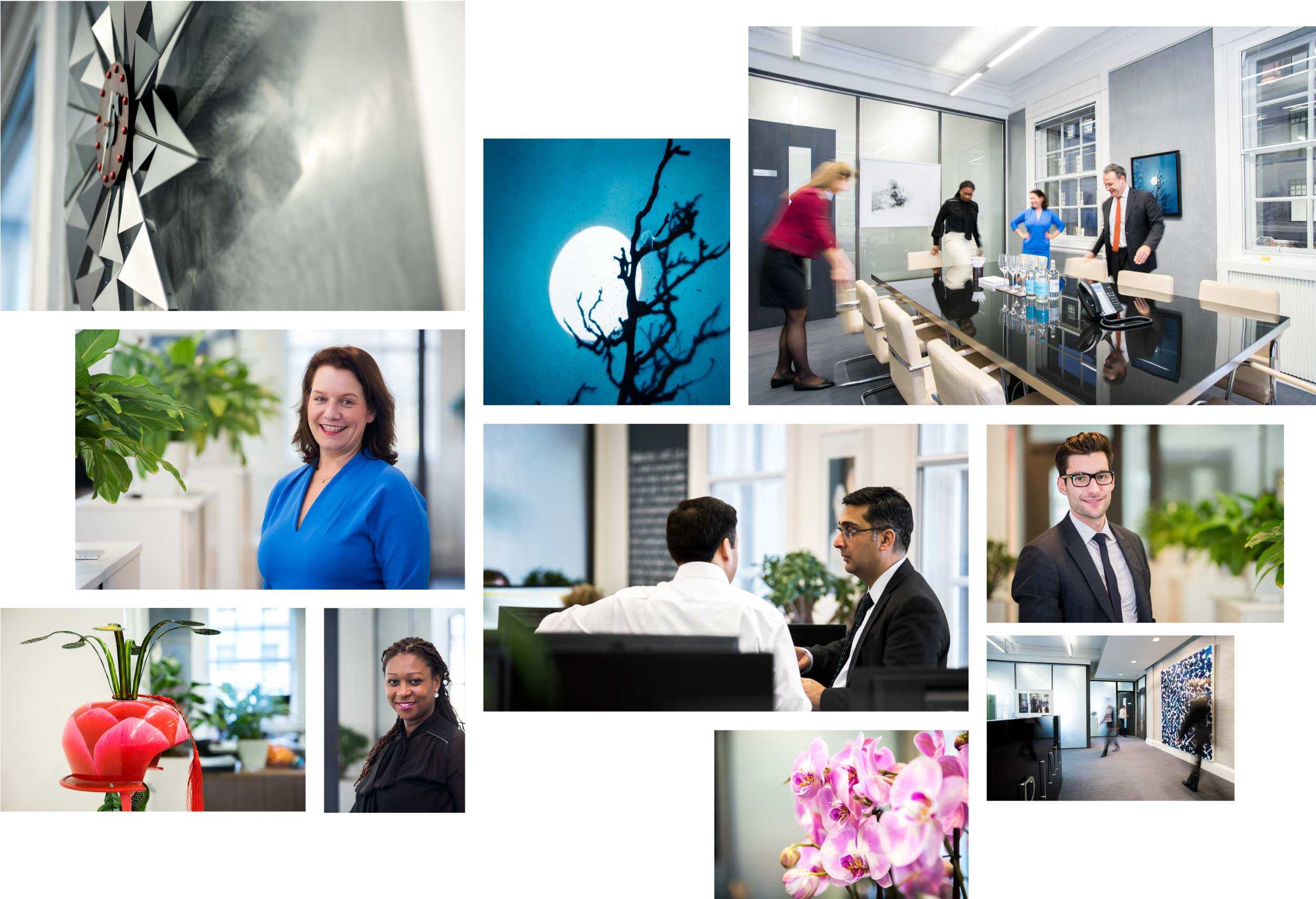
Photography
Photography plays a crucial part in conveying brand personality. With this in mind we avoided stock photography and commissioned a photographer to take authentic photographs of the staff and office environment.
Typography
Whilst purposeful use of space and good photography help set the tone of the site, perhaps the most important element of the new website was the choice of typefaces. It was decided that pairing a serif and sans-serif typeface would be effective in showcasing the contemporary and traditional aspects of Plurimi.
We experimented with a range of combinations before choosing Playfair and Sofia Pro. Playfair is well suited for titles and headlines and is used sparingly across the website. Stylistically Playfair pairs well with the warm and humanist Sofia Pro, which is used for body copy and majority of text.

Fine details
We looked closely at how we could add small touches that would make the process of traveling through the site a beautiful experience.
We implemented a subtle and smooth parallax effect that helped create an elegant look. When scrolling, the photographs and body copy move at slightly different speeds. The results are subtle, but provide an interesting dynamic when navigating the website.
Check out the new site at plurimi.com

