We're really lucky to work with a really wide range of clients, from multinational Plc's to one person start-ups. Our mission is to always make the most of every project that comes our way, and we rarely look at a project as just 'bread and butter' – each one is a chance to try something new. A couple of weeks ago we were asked to help with a project that really got us excited, and certainly left the door wide open to try some new things.

Dust&Things is a recently launched business, creating bespoke themed wedding stationery packages. The founder, Sian, needed a new identity as she was using Facebook as a marketing platform and wanted to take the business to the next level and beyond.
As soon as we read the brief we knew it was right up our street. Sian told us that she focused the business on "creating nature based items, which aim to be beautiful, natural, un-fussy, dainty and tactile." She also said "There are no sparkly jewels, shimmer or glitter in sight! I am a huge advocate of the British flora and fauna."
We were hooked but Sian continued to impress us with her list of descriptive words, photos of things she likes and is inspired by, and a little more description into the vintage, hand drawn, crafty, nature approach she yearned for – The perfect brief!
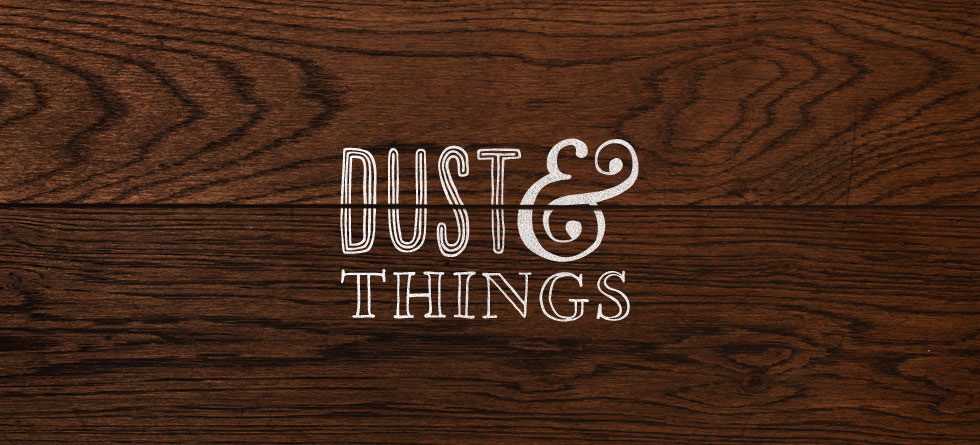
 We wanted to create a logo mark that was authentic, rustic and had the feeling of craft about it. Hand rendered type was the perfect technique for this project as it stripped back the mark to is most basic form and avoids the hard graphic lines of a computer generated logo.
We knew straight away that we needed to put the technology to one side and get the pens and pencils out. This was perfect for Gareth who is an incredible illustrator and has a love for hand rendered type. He gave us a little insight into his thought process when this job was passed to him;
This was a project that excited me as I read through the brief, and immedietly started to get the look and feel of the brand in my head. Within the fact find, Sian had used lots of words such as natural, rustic and handmade. I felt as Dust&Things are a company that create stationery for weddings and special occasions, it should certainly have a hint of elegance to the brand.

Later he added;
After numerous sketches and playing with different type finishes, I found a combination that conveyed a balance between elegance and fun. The ampersand is the real feature of the logo, and has a real charm to it — I wanted the logo to say "we love what we do".
 The hand drawn ampersand was central to the logo, so we extracted it to use as a stand alone mark, for social media, stickers, stamps and other applications.
Once we were happy with the initial concept we created a presentation to show how the identity could work in various instances and as part of a larger brand system. We also provided rationale for our idea.
Clearly, a detailed brief and a thorough understanding of the client, their business, personality and customers helped, as Sian loved the initial concept and wanted to get rolling with it immediately. In fact the email we had signing off their chosen identity was the best testimonial we could have had;
We absolutely love the designs! We fell for number one the most and would like to go with that one, it's great. I'm so glad you guys are involved, I now understand how important branding is!
We're always proud that we make the most of our projects regardless of size and this is a clear example of that. A creative and fun project that has resulted in a very happy client and a beautiful addition to our portfolio.

