As we prepared to shut down the studio for the long Easter weekend we decided to take an extra day to do something as a team, so on Thursday the seven of us headed in convoy to Bristol. Our destination was the Centre for Fine Print Research at the Bower Ashton Campus of UWE. We'd heard about this place from a friend, so booked ourselves in for day of learning letterpress. Mike and I both went to art collage. The old fashioned sort with a print room filled with inks, presses, screen printing facilities and old and well used equipment, so we loved the idea of getting away from the shiny screens and getting messy.
In the run up to our visit, Angie our mentor for the day, asked us all to think of a theme we could use. We chose our favourite quotes (or in some cases, the first one that came to mind!)
The facilities at CFPR are amazing—almost exactly like our old print room in collage. Old, dirty beautiful machinery, pots of ink, wooden tables and draw after draw of metal and wooden letters.

The day started with Angie talking us through the technical aspects of the letterpress processes, showing us the tools we'd be using. After a 15 minute intro it reminded us all how many terms and artefacts we still use everyday that go back to the days of letterpress. We were shown boxes full of lead blocks we'd be using to space our letters. Each block had a name — em, en, thick, med and thin. We were each given a composing stick and told how to hold it (this is where the term "wrong end of the stick" comes from). We were asked to be careful when putting the letters back in their boxes. As you can imagine, it's easy to mistake a lowercase p for a d, b or q. That's where the saying "mind your p's and q's" originated.
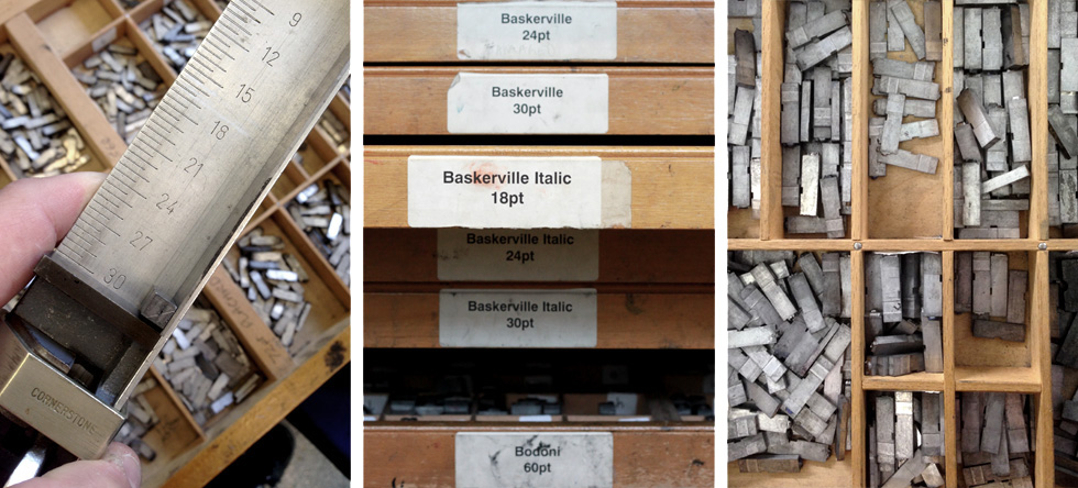
Angie then showed us the typefaces we'd be using, each set out in a draw containing a single font. She explained that fonts were stored in separate wooden cases on top of each other, one containing small letters kept in a lower case and capitals in a case above—the upper case. Who knew?! The font cases included Garamond, Clarendon, Times, Univers and Gill Sans among many others.
With our composing sticks in hand we got started type setting our quotes—one letter at a time. At this point we all started feeling pretty pleased none of us had chosen anything particularly long as this turned out to be a time consuming job, taking us the best part of half an hour.

Once we'd set our type we moved all our quotes onto the proof press which we'd be using to print with. Angie showed us how to fix and lock up our type using wooden 'furniture' and leading to space it out. This process showed us just how meticulous and arduous the task is—and that's just for our few words. There were beautiful examples of entire books that had been produced in the same way. I can't imagine the patience needed for that! Certainly puts the spinning beach ball into perspective.
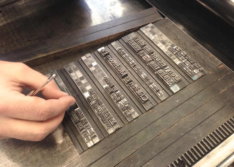
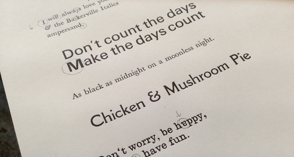
The next task was to ink the rollers and run our first proof so we could correct any mistakes. There were a few, including upside-down letters and incorrect fonts. With those fixed we ran some more proofs and a final edition.
[vimeo clip_id="92525983"]
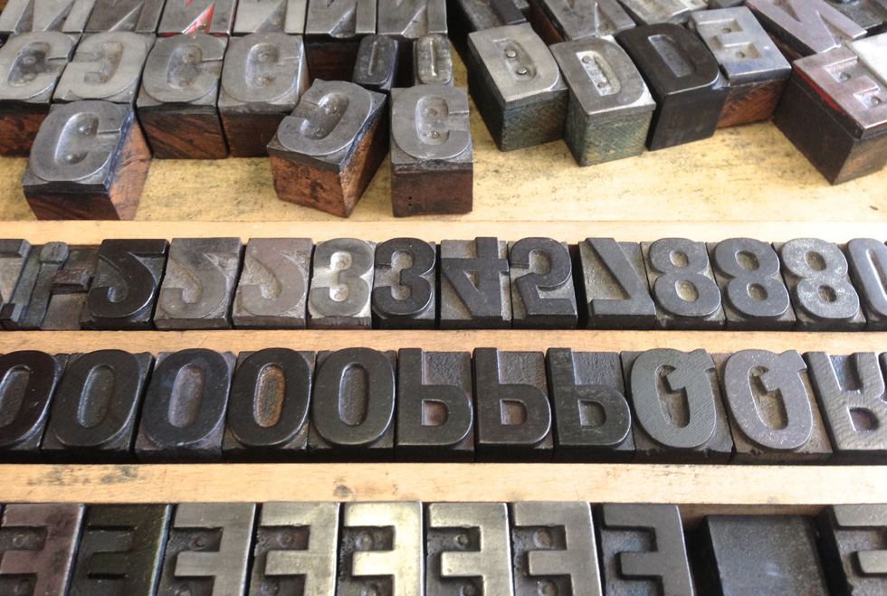
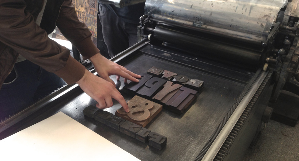
After a quick lunch break we moved onto some wood type posters. Again Angie showed us drawer after drawer of beautiful hand crafted wooden letters in an assortment of typefaces and sizes. We split into two groups and started to decide on what our posters should say. Despite the numerous drawers of letters it became clear that many sets had missing letters, so we chose our designs based on what complete words we could make with each face.
Hamish, Mike and Gareth went with "Old is the new new" and myself, Paul, Rob and Bryn made a poster with "Love type & pixels". We roughly set out our posters on two proof presses and Angie (very patiently) helped us lock up using the same wooden furniture and lead blocks.
This process turned out to be even more time zapping than using metal type because every gap needed to be tightly filled, leaving no room for wiggles. After about two hours of planning, set up and tinkering with lead spacers we were locked down and ready to print our first poster proofs.

[vimeo clip_id="92525858"]
Then the real fiddly stuff started... It turns out that 100+ year old wooden letters aren't all pristine or the same height, so we had large portions of our designs that were either very light or didn't pick up any ink at all! So, we identified which areas needed work and set about padding up each letter by adding small pieces of paper under the offending characters.


After another hour of tweaking and proofing both teams had their type sorted and were ready to print our final editions. We think they both turned out great, considering it was our first time.

It really was a great day. Great to learn so much about the history of stuff we take for granted. Great to find out where names and terms we use every day come from. Great to spend a day as a team getting mucky and working together. Great to produce design work truly by hand without a mouse or keyboard in sight.

But, the greatest part for me was to spend the day with Angie whose passion, love and knowledge of fine print and letterpress couldn't help but get us excited. The facilities over at CFPR are absolutely terrific—and rarely found, so I'd urge you to get in touch and book a day learning something that's unique, fun and will definitely give you a better understanding of what we do as designers.

