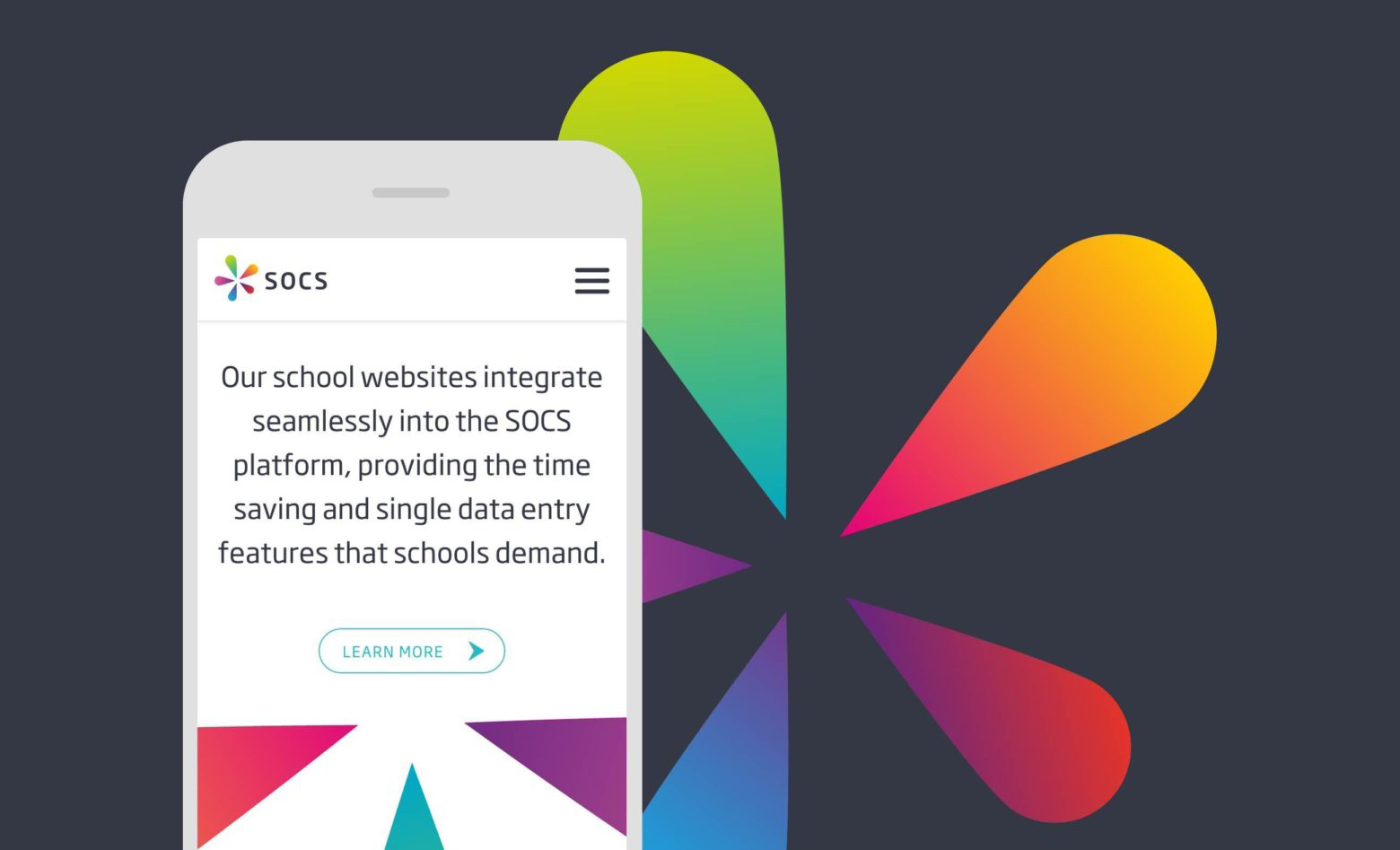
A white label software application that can be applied to any school website, it can also be completely integrated into the schools online systems, even down to the styling of the school website.
The Problem
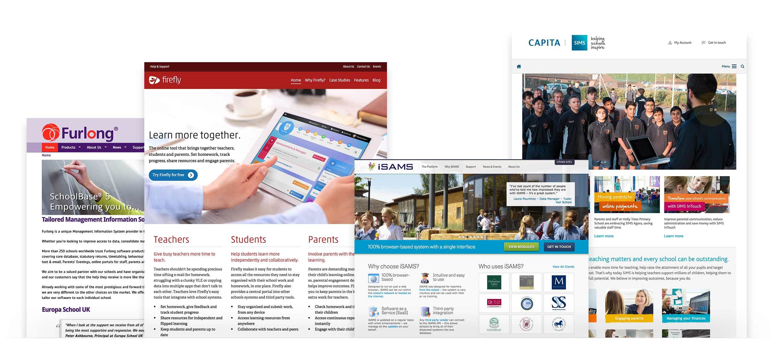
SOCS were working with a brand that didn’t reflect the high spec nature of their product. It also didn’t reflect the energy of the team behind the business or their approach to supporting their customers.

Research
We kicked off this project with a thorough research phase. SOCS is a business with many different strings to its bow and the new branding needed to represent all of these in a coherent and applicable way. We planned a branding workshop to discover exactly who their audiences are and their needs. We also outlined what the measures of success would be and investigated the internal and external perceptions of the company.
Brand Presentation
Armed with our research, we went ahead and started to imagine a new brand identity. We presented a bold and flexible colour palette to help SOCS stand out amongst their competitors, and came up with a logo that represented the connections they help people make.
Much of what SOCS does centres around sport, so the new brand needed to feel energetic and vibrant. Being a tech company it also needed to be clean, modern and memorable.

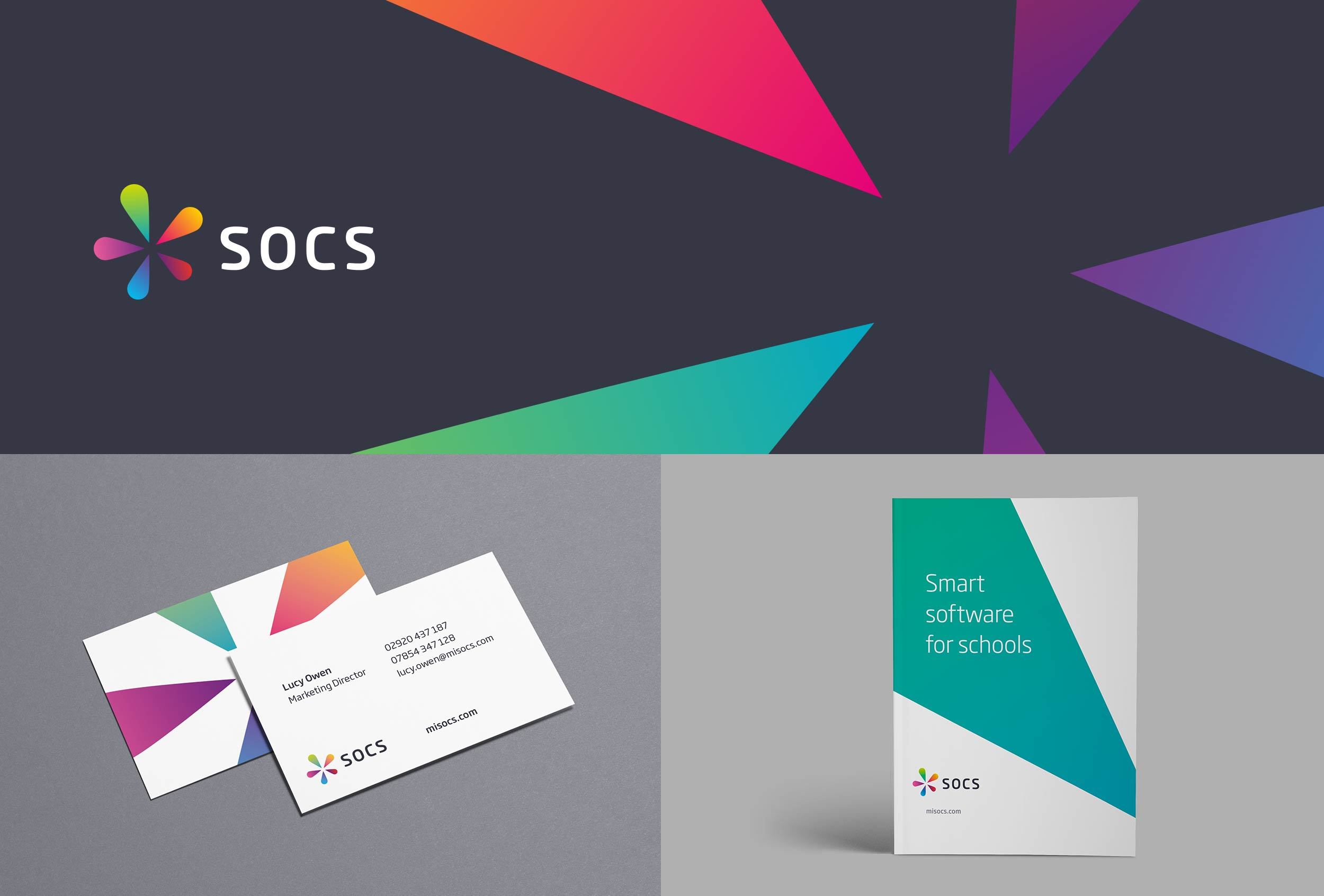
The logo was a complete departure from the old one and the outcome was not at all what SOCS imagined—but they found it fascinating how we had interpreted the results of the workshop and how we viewed them as a company. They loved the vibrancy of the colours and felt these represented all the different people in the team as well as all the different kinds of customers.
Iconography
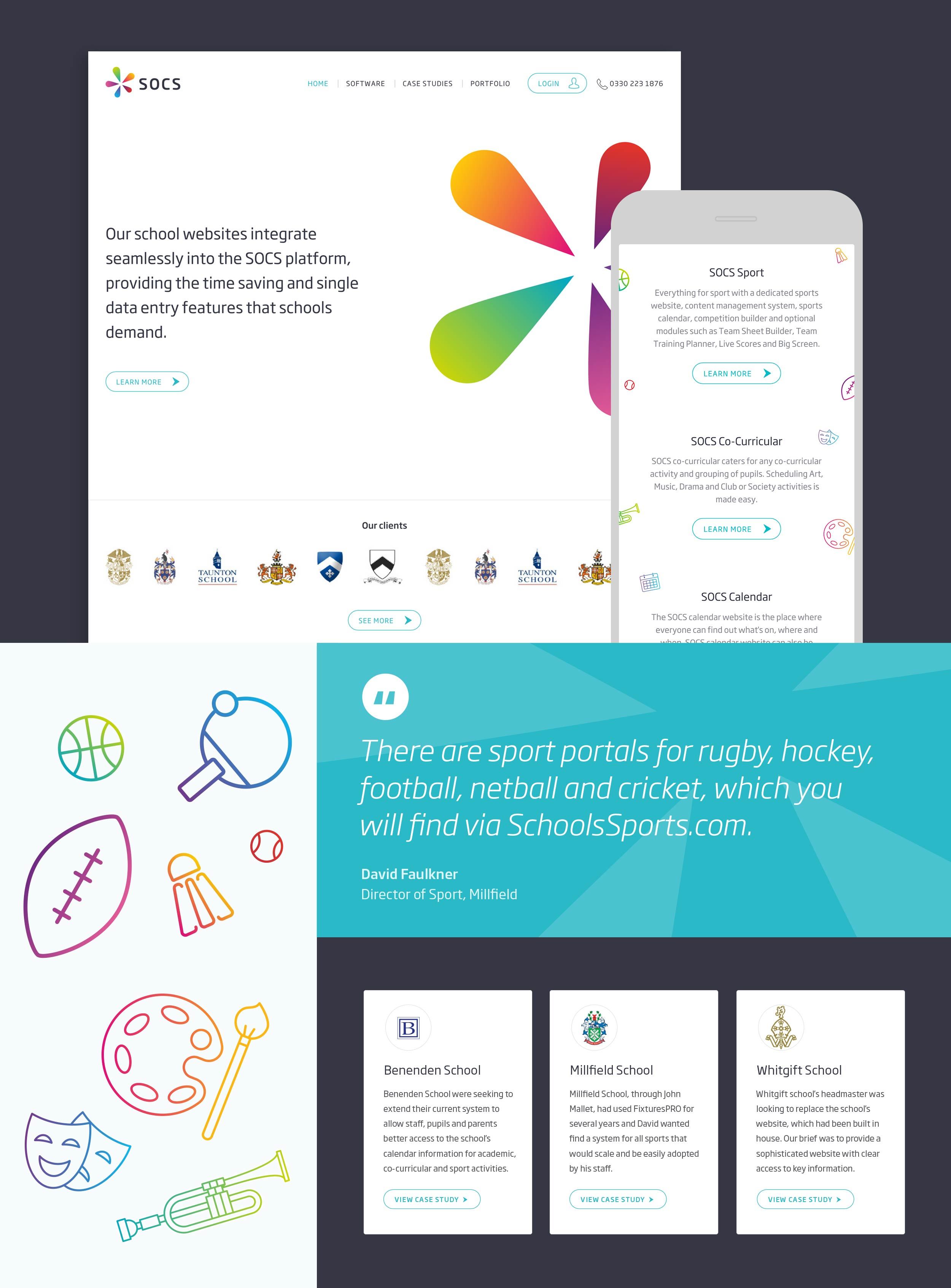
We carried through the bright and bold colours through to the icon designs. We kept them simple and illustrative to enable them to easily be used throughout the website.

Website Style Guide
When it came to the website, the SOCS team needed a foundation to build upon as they would be doing the development in-house. We created a style guide containing type styles, a grid system and a range of key components, along with some of the major page templates.
Results
We loved working with the SOCS team. They were extremely open to new ideas and very happy to take our lead in terms of design and technical recommendations. The result is a new brand and website design direction that embodies everything SOCS is and wants to achieve going forward.

