
Our first step was to understand their brand identity—this uncovered further challenges. Firstly, the team were keen to utilise a single typographic style and a colour palette of just two shades of blue. Secondly the company wanted to avoid imagery or illustration and had no graphical assets to utilise. It's a good thing we love challenges!
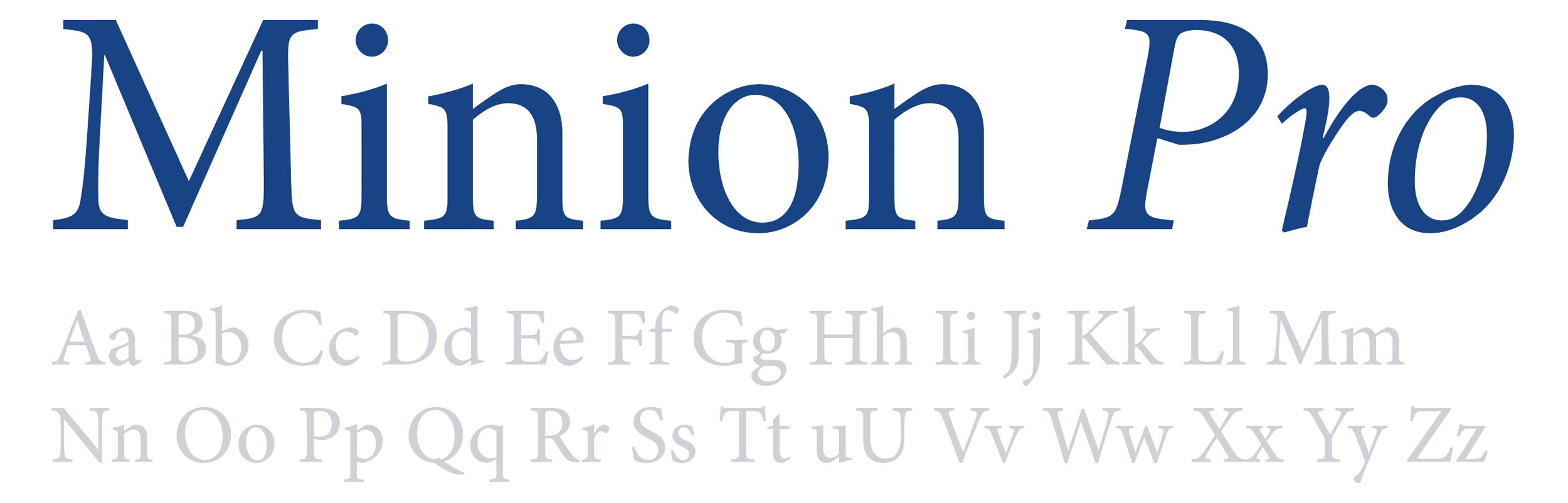
During the design phase we researched and tested a whole range of type options. The chosen typeface needed to optimise quality of service, trustworthiness and authority, whilst being adaptable and flexible enough to be used throughout the site. We decided on Minion Pro—a typeface known for its elegance and readability, after all it's what 'The Elements of Typographic Style' (the typographers bible) is set in.

Next, we looked at various graphic treatments to help reinforce what the company stands for, whilst helping the design come to life. The company name comes from the word 'Synapse', the name for a structure within the nervous system that allows cells to pass information back and forth. We came up with the idea of a living nervous system using interconnecting dots.
As you can see from one of our early prototypes above, bringing this nervous system to life by using HTML Canvas helps add a touch of interactivity and playfulness to an otherwise serious looking website.

The new website has gained a lot of positive feedback, both on the design and the ease of use.

As part of the project we helped the Synaps team understand how to structure their site to make the content more accessible. Heavy, text rich pages have been broken up into chunks to enable quick scanning and the key messages have been highlighted.

Like many of our websites we utilised Craft CMS to control the content on the new site. This was key for the Synaps team as they wanted a system that was easy for non-technical administrators to use, but powerful and flexible enough to adapt to their changing needs. We developed a range of modules such as team profiles, news snippets and key calls to action that admins can drop into the content.

Associate Partner, Natasha Reeves said:
"When we started to look for web designers we met with a number of companies but after the first meeting with Toward it was clear that they were the team to take our project forward. They listened to what we wanted and offered us invaluable help with our style while keeping our views about brand in mind. They understood our business quickly and were enthusiastic about the project.
Their experienced and friendly approach made the project a success and they have always been a phone call away for any queries or assistance we have needed. The new website has gained a lot of positive feedback both on the design and the ease of use. We look forward to working with them in the future."
Tackling a project with so many constraints has been challenging, but a lot of fun. We've managed to create a balance of authority and seriousness with just enough playfulness to make it interesting and engaging. Visit the site at www.synapsllp.com

