Within weeks of the global launch of the new brand vision and identity, they announced their acquisition by Marstons Holdings - the UK’s leading provider of integrated, technology-enabled transport solutions.
This meant that the Toward team faced a rather unique question - How do we transform a brand narrative that we just created so that it fits comfortably into the core values of a new parent organisation.
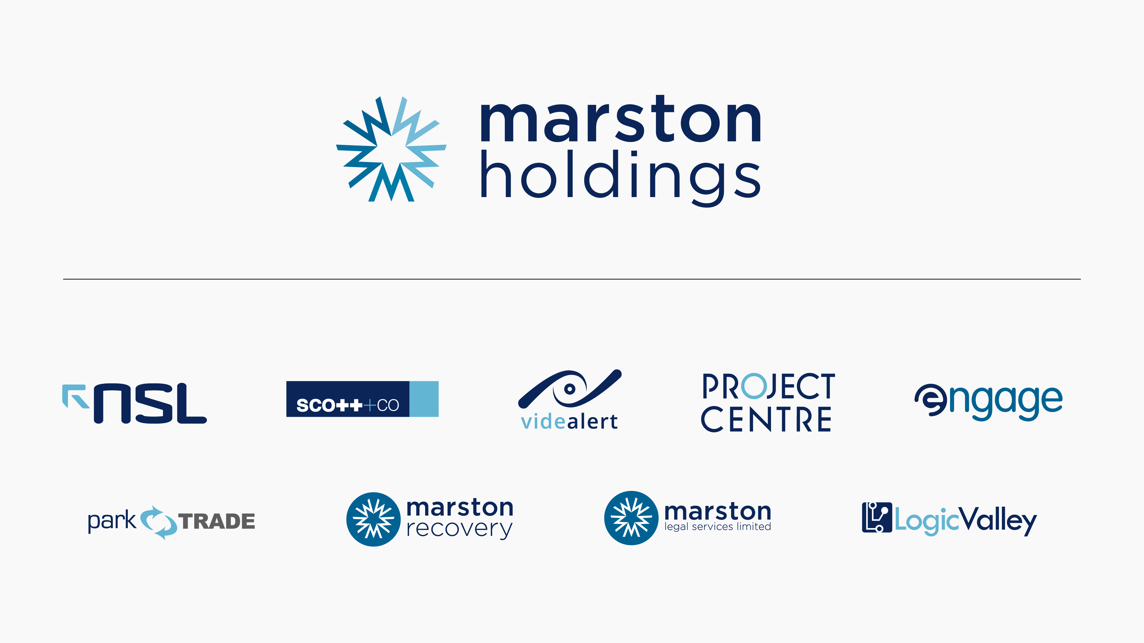
Marston comprises a portfolio of brands all of which are specialists in their field. They support the government, utilities and private sectors through the delivery of market-leading integrated technology-enabled solutions and Vortex’s acquisition enhances its end-to-end air quality and decarbonisation offering.
As with all companies, Marston has a mission, a vision for the future. In its mission to provide a holistic service as one entity—and not as a collection of businesses—each of its acquisitions adopt the Marston colour palette. It’s their way of unifying each brand, creating a connection to Marston whilst maintaining their (now connected) individual service offerings.
But what does this mean for the Vortex brand?
A big part of what we do involves digging into the companies we work with to find out who they are, what they do and why they do it. This discovery process forms the foundations of all our projects and is key to their success.
Everything we do or create is underpinned by a core vision, a thread that runs every aspect to help create something unique to the client. In this case, the Vortex brand is rooted in green while Marston in blue.

The answer comes from finding a connection
Despite the difference in colour, Marston Holdings and Vortex share a vision to provide government and industry with the tools they need to achieve decarbonisation resulting in the provision of healthier, happier communities and a cleaner planet.
It’s this principle that should ultimately drive any creative thinking. If the design points back to that and is consistent in how it’s applied there’s a very good chance that any colour will have the desired impact.
From our perspective, blue didn’t carry the same subliminal sense of positivity and regeneration that green does, but it does provide the feeling of clarity, open space, freshness and freedom. It’s a colour palette that gave us plenty to work with and can still point back to the organisation's shared core values.

This is a prime example of how a brand system needs to be adaptable in the ever-changing world of business and ultimately demonstrates how, even when something as important as an entire colour palette changes, it’s your values that truly matter.


