
Today we put the new version of our studio site live. We last did a major redesign in 2010, with several tweaks along the way between then and now.
We've always had good feedback on the site, with people saying it really represents our culture, work and 'Toward way'. Whilst we were pretty happy with it, we've come quite along way in 3 years, so we wanted to better reflect the digital services we offer, which now make up more than half of our work.
It was very much a team effort with the design led by Tom, illustrations created by Gareth, content written by Rob, built by Paul and proofed and prodded by Mike. We made the decision to keep the content to a minimum in terms of amount of copy, remove the Twitter feed and ensure our personality oozed from every part of the site. Attention to detail was key.
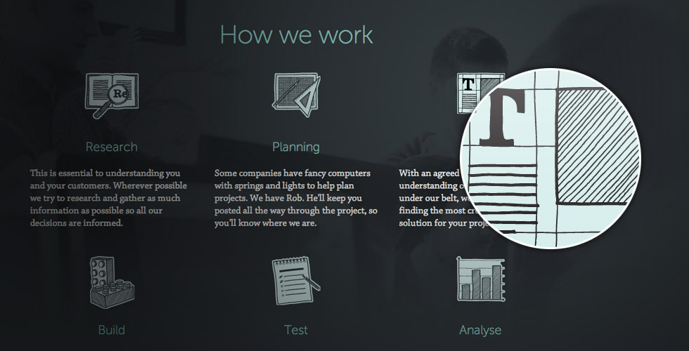
As well as more colour, we now have a feed from out Instagram account on our about page, so users can get a warts and all look into Studio Stuff. We also took some nice new team photos – in a back alley of Newport on a windy day, that's dedication. We've also condensed our services, we still offer the same but wanted to make it more clear what we do and we also added a nice section about how we do it, our process. We find that people like to know how we work so including that here was an important part of the new site.
If you take a look at our work section you may notice some projects there that weren't on the previous version of the site. We've been waiting for the new site to show them off in the way they deserve so if you have time, please take a look at the work we have done for Zoosme, Whitgift Care and St David's Hospice Care. There's loads of new work due to arrive soon.
Of course a Toward site wouldn't be complete without our doodles so this section is well and truly included in the new version. We've even got a new doodle set, Oscar Nominees 2013. There are also some lovely little gems throughout the site but we won't reveal them here. Hopefully people will stumble across them as they take a peek at the site.

From a structure and layout point of view the old site served us well, so although the site has been rebuilt from the ground up, we haven't drastically changed the form. To ensure the code is as clean and lean as possible we decided against using an existing frontend framework, opting instead to build the layout entirely from scratch. Where possible we've introduced features and functions specific to touch screen devices, such as the swipe based slideshows. We've also used SVG's and double size PNG's to ensure pin point sharpness on fancy new retina and high-resolution screens.
From the technical side, we've used a mixture of rem and em sizing throughout the site to ensure as much flexibility as possible. Using LESS as the css preprocessor during the project has helped speed up the build considerably and also helped in maintaining a clean stylesheet. With this incarnation of the website we've taken extra care to ensure that the site looks and functions perfectly at all conceivable device widths, and not just at predefined breakpoints.
We really hope you like how the site has turned out. As with all websites, it's not finished. We've got improvements and tweaks already planned, although don't tell Paul, he'll go mad. Have a poke around and drop us a tweet with your feedback!

