Breaking the mold of IT providers

Circle

Branding Web Design
Circle website home page displayed on a laptop with a red background

Brief

Circle approached Toward to redefine the brand positioning to establish itself in a new market, and add value—with the aim of being acquired within five years.

Outcome

Challenging the typical 'IT company' format, we delivered an ambitious and animated brand that captures Circle's energy, ingenuity and drive.  

Results

Following the brand launch Circle was acquired by the Arrow Group.

2 Circle ID cards containing branded illustrations
The Circle IT website on mobile, showing a graphic and some short text 'tech driven, people focused'.
A large screen showing a Circle Webinar slide with a colourful circular illustration
A large screen showing another Circle webinar slide with a cloud illustration

‘IT’ is one of those acronyms that is hard not to read as ‘it’. Our solution to the problem was to remove the problem. We simplified the company name from Circle IT to Circle, avoiding confusion and strengthening the brand's visual language.

the previous Circle IT logo
The new Circle IT logo

Circle's Bold Red Rebrand. We ditched the dull blues and muted tones of traditional IT companies and embraced a vibrant, future-friendly colour scheme. Say goodbye to purple and hello to eye-catching red, supported by a range of bright colours and plenty of white space.

A purple Circle IT billboard under a bridge showing a colourful illustration of a yellow circle travelling through pink circles

2020 saw our usual brand reveals on a big screen with a room full of people swapped with small screens and a Zoom room full of people. We adapted and created a dynamic and energetic brand reveal video that showcased Circle's new look and feel in all its glory.

Breaking away from ‘IT’ clichés, we used the flexibility of the circle shape to create a bright and playful visual language. The abstract approach allowed more freedom to find creative ways to represent IT services and solutions, brought to life with motion.

A poster advertising Circle's back up and recovery service located on a train station platform

Toward took time to understand our goals and desired outcomes and proposed a rebrand and website that surpassed any of our expectations.

Jack Addicott

Sales Manager
On the right is a ring of overlapping multicoloured circles with space for one more circle to complete it. On the left is a single dotted ring. There is a label that says Careers.
A large blue semi-circle with three small circles underneath it like pillars. There is a label that says Local Government Sector.
On the left is a large yellow circle and on the right is a smaller pink circle. Between them are curved dotted blue lines radiating from the large yellow circle. There is a label that says Media IT Services
On the right is a solid blue circle. On the left is a yellow dashed ring the same size with a small solid blue circle in the centre. There are two lighter blue circles radiating out from the small solid blue circle. There is a label that says Disaster recovery.
On the right are two vertical pill shapes with a red outline next to each other. The furthest right pill shape has a purple circle and a blue circle in it. The pill shape next to it has one yellow circle in it with space for another circle. On the left is a teal-coloured circle moving into the space. There is a label that says Privacy policy.
Two long rectangles with round ends positioned on top of each other with a gap between them. The top one is a teal colour, the bottom one is a blue colour. There is a pink circular ring positioned over the blue shape and inside the pink ring the blue shape is larger. There is a label that says Legal Sector
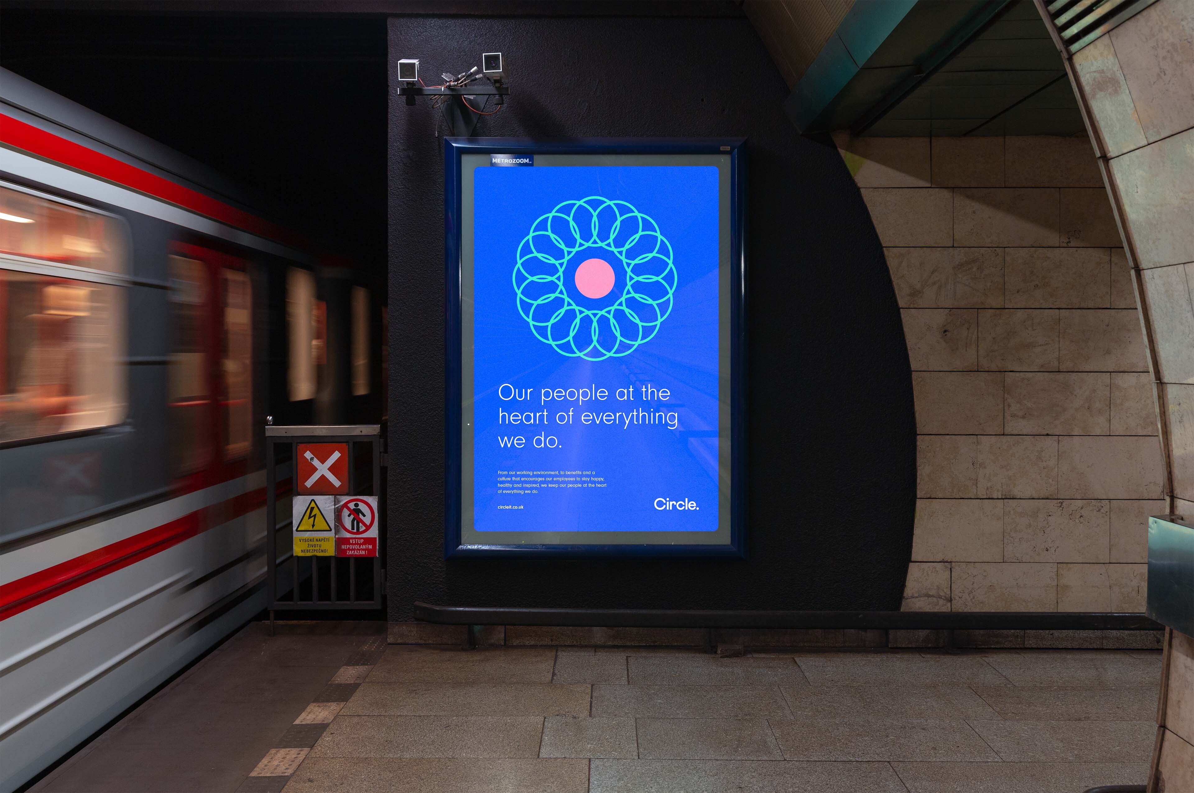
A poster advertising Circle on a tube station. A train is going past.

To accompany the rebrand, We rebuilt their website from scratch. First, we restructured their content for maximum user-friendliness. Then, we created a streamlined, modular design system that makes it easy for Circle to create visually stunning pages on their own.

The case studies page of the Circle website displayed on a laptop.There is a pink background behind the laptop.
A screenshot of some of the available content blocks on the Circle website
A screen shot of the What We Do card components on the Circle website
3 screenshots of the website displayed on mobile devices, each showing a different content block

Even during unprecedented times, we managed to have some fun along the way and the whole business has been delighted with the end results.

Jack Addicott

Sales Manager

Landscape changing brands, websites & campaigns, designed to transform companies.

How we do it