We received a range of applications generally from people with 0-5 years industry experience. Whilst reviewing each application I noticed a trend I’ve seen growing over the last few years—the ‘skills infographic’.
Out of respect to our applicants here are some examples of what I’m talking about, found on the web:
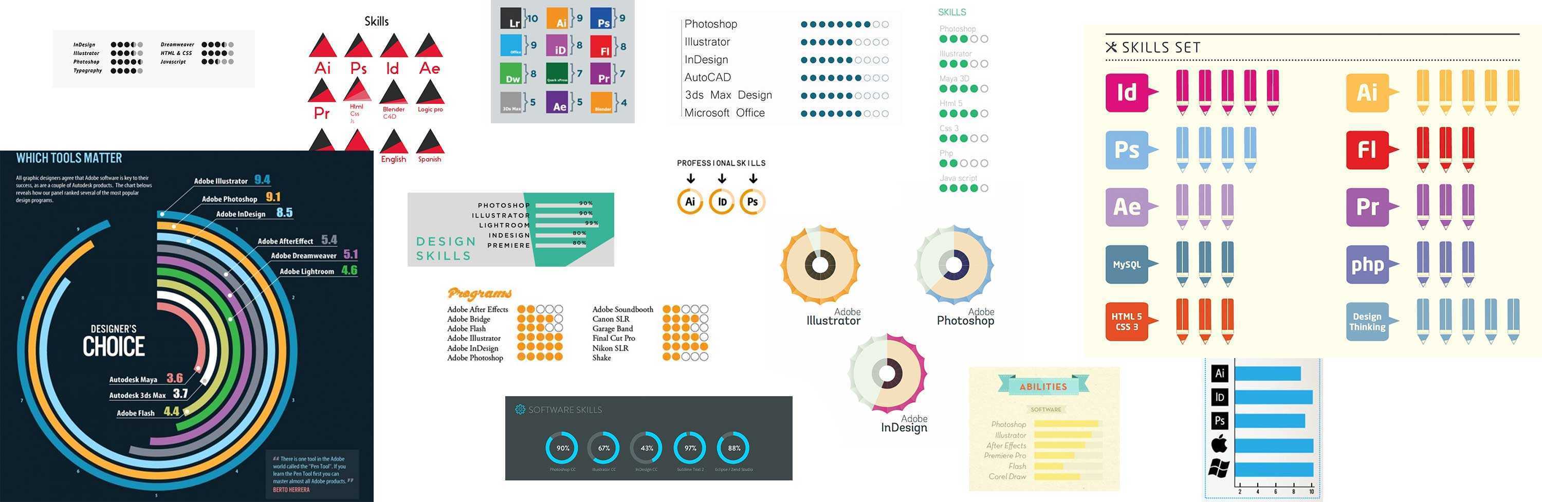
I don’t like them. I don’t think they serve a purpose and I want them to go away. Here’s why:
Software is a tool
The most worrying thing about their increasing usage is the emphasis young designers are putting on their level of software skills. Of course competence in software is important—but Photoshop and Illustrator are the tools we use to bring our vision to life. Our ‘skill’ is understanding a problem and developing ideas that solve it.
Very few applicants even mention creative thinking, problem solving or understanding research, yet they virtually all mention how good their IT skills are. Knowledge of software is now seemingly being seen as a competitive advantage over all other skills.
A carpenter can use a hammer and chisel to turn a rough pile of wood into a beautiful cabinet. The skill is in the knowledge and experience that makes this possible—not the tools he uses. Which prompted me to make my own infographic:

Design is no different. A designer's skill is to use their tools to turn a rough sketch or idea into a beautiful and functional end product. Someone with ‘9/10 in Photoshop’, but 1/10 in idea generation is not a great designer.
They’re meaningless
What does '95% in Photoshop' mean? Absolutely nothing. How can anyone accurately measure how good they are at using software in percentage terms? They can’t. I can’t. I’ve been using Adobe products for 20 years and I’ve no idea how accomplished I am on a scale of 1-100. I know enough to turn my ideas into solutions—that’s enough.

They’re completely unoriginal
I received 58 applications that included a software infographic. 58! It’s possibly the most unoriginal thing you can include on a CV. Part of a designers job is to come up with innovative and original ways of answering a problem or communicating a message, so it amazes me that so many people use the very same graphics on their job applications.

I asked my twitter followers where this trend comes from and a number of people said Pinterest, so I did some digging. Lo and behold the site is full of them. Page upon page of predesigned templates for designer CVs virtually all including skills charts. Most worryingly, some of the templates available on Pinterest are the very same ones sent to me by designers wanting a job.
They highlight weakness
If a chart is intended to show how good you are at something, by definition it will also show how weak you are at something else.
They also highlight if you’re out of touch. 22 of the CVs I received included Flash in their list of ‘skills’. Not one included Sketch. When I’m hiring a designer I want to see people at the cutting edge of the industry. People who are breaking new ground and trying new tools. Not ones who can design a Flash intro for a website.
The proof is in the eating
From my research I learned that in some cases universities and recruiters are encouraging the use of these graphics, so I don’t entirely blame designers—especially recent graduates. I often find both of these are out of touch with what the industry is looking for.
I was extremely conscious not to negatively judge candidates who used them in their applications, instead focusing on the elements I was looking for—ideas, solutions and the final execution of their work.
But as we whittled down the 76 possibles to a shortlist of 7 or 8, guess what... Yep, you guessed it—not a single one included a skills infographic in their CV. What this tells me is that the best applicants focus on their talent and ability, rather than on how good they are at software.
So, for designers applying for jobs (especially at agencies) I implore you: Please, think carefully about what these infographics say about you as a designer. Do something original; do something that stands you apart; do something that shows how good a designer you are, and above all—Please, please, please stop using templates found on Pinterest!
If you want to find out what we look for in designers applying for jobs, check out my post How to contact a design agency.

