Having worked with Sport Wales recently on the touch screen experience for their reception screens, we were delighted when Adam from Sport Wales recommended us to the research team when they needed to bring some data to life.
What does bringing data to life mean? Well in this case we needed to take masses of raw data, and create a way of delivering it in an engaging, accessible and friendly way, in the form of infographics. We love projects like this, creative, a hint of storytelling and a chance to further extend our work and relationship with an existing client. Before we got stuck in though, the Sport Wales research team had the enormous task of collating, organising and dissecting tens of thousands of pieces of data (rather them than us!).

The School Sport Survey is the largest survey of any kind of young people in the UK. It canvasses the opinions of 110,000 Welsh schoolchildren from almost 1000 schools. That's a lot of work which resulted in a lot of data, all delivered in spreadsheets.
The Sport Wales research team then had to find the story amongst the data. They had to spot the trends, establish what the insights were and highlight any interesting behaviour that the data showed. Once they had completed this work, and found the story, we were then asked to meet with them to discuss how this data could be presented in an engaging way to their audience.

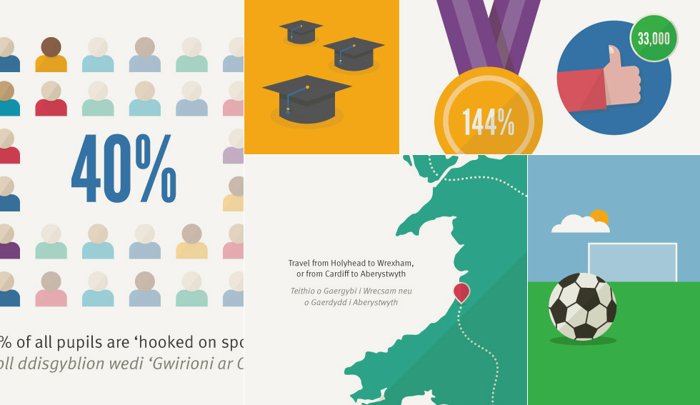
The main message focused on the number of children who are 'hooked on sport'. Several factors determined this percentage, and we had to provide infographics to show these little insights and the overall hooked on sport statistic.
With the data in mind we decided on the best design style, layout and process for creating 83 unique, bilingual infographics that covered all the various messages. Once the data was ready we were able to create illustrations to represent each statistic and a design template for the graphics. We also designed a simple identity for the School Sport Survey and Hooked on Sport titles.
 As 78 infographics needed to be created using the same template, we used methods to help reduce design time. One of these methods included using the 'scale by percentage' tool in Adobe Illustrator, which allowed us to quickly resize this percentage bar, as each one was unique.
The Sport Wales team needed 78 infographics to show the results of the survey by consortium, constituency, local authorities, electoral region and health boards. These all made up the core data set which had the same illustrations so once we had the template and graphics signed off we were then able to create each unique version by changing the percentages. This meant good attention to detail and plenty of cross referencing and checking.

We then had to work on infographics for 5 more sets of data and these were all unique. They illustrated the overall facts and figures for the survey, who is hooked on sport, the increased probability of being hooked on sport, how we can get more pupils hooked on sport and some fun facts about the survey and data.
Once we had finalised the files, all 83 infographics were delivered as JPEG and PDF format for use online, via social media and as part of onscreen presentations.
It was fun to be involved in the whole process. We were't just emailed spreadsheets, we were consulted on the themes, asked advice on how much information to include and given creative freedom on the style of illustration we chose. It was an absolute pleasure to work on (even with the deadline pressures) and the feedback on the infographics has been very positive.
You can find out more about the survey and see our completed infographics on the Sport Wales site.

